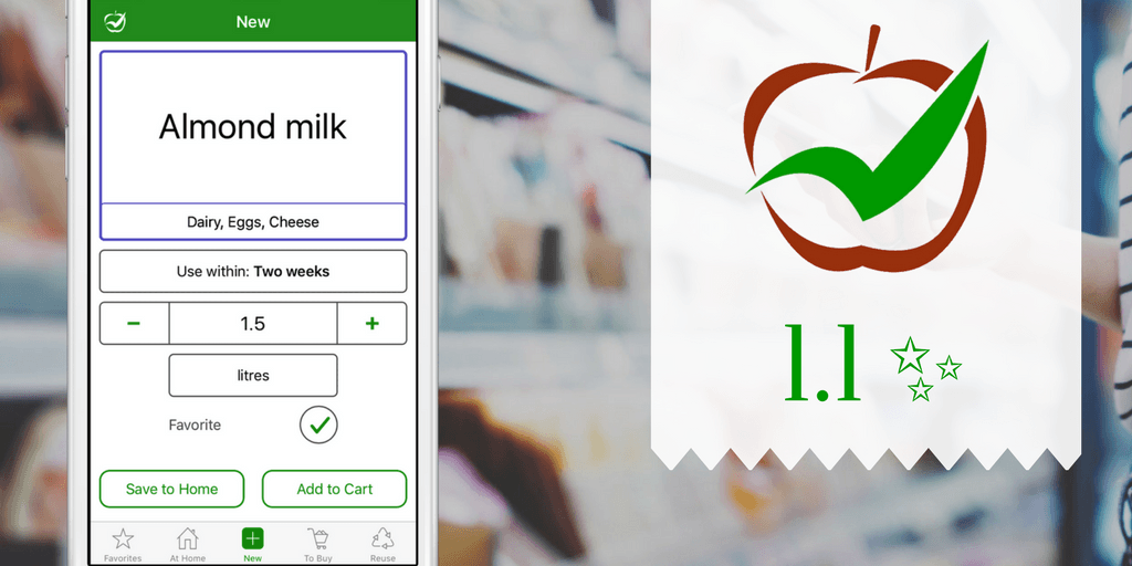
CozZo 1.1 is out and we’re excited to share what is new. A huge “thank you” to all of you, who contributed to make things work and look better – we’re always open to your suggestions and criticism. And so, we deep dived into the latest Apple technology, combining your feedback with our creative ideas and this is what came out of it.
 Faster product creation. As much as we all want to have an app that just reads our mind and knows magically what hides in our fridge and cupboards – it’s just not possible outside of Harry Potter’s world. We have been asked many times, especially by people living in the UK about barcode scanning – everyone has seen how quick and easy is for cashiers to read products with their laser-based devices.
Independent app developers like us can’t build the same experience for two reasons: your phone camera is much slower and less precise than a laser; we depend on the availability of barcode databases and for some countries, there are none (including UK).
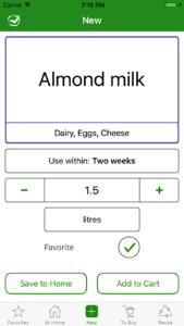
So we did the next best thing – the “NEW” screen has been redesigned by positioning and sizing all inputs for better reach and faster selection. “Always buy when Finished” and “Send to Home when Bought” selections were removed, replaced by a new feature (see below).
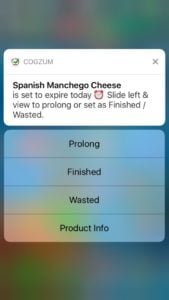 Effortless inventory updates. Keeping the home list of products and cooked meals in good shape can be challenging when you’re doing it alone (in future, CozZo will allow for all people in a household to share this catalogue and manage it together). To address this, every day our app checks your “At Home” list and finds the products that require an action. A notification (the short message that pops on the top of your screen with a ‘ding’ sound) is then sent to you at the right time. In CozZo 1.1, we upgraded all those reminders with better messages and contextual action buttons. For example, we added “Prolong”, “Finished” and “Wasted” actions to notification about products that expire today. Tapping on a button makes an immediate update or opens the app at the right place for a super quick change.
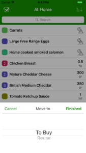 A better way to move products between lists. An essential principle in CozZo is that products are created once and then moved between different lists. We removed two NEW screen selectors that were meant to set the default movement paths because users found it hard to decide on them. They are replaced with much more flexible “Move to” selection which is triggered by a tap on “Bought” and “Finished” buttons. It allows for an on-the-go choice whether a product should be sent to “At Home”, “To Buy” or “Reuse” lists and sets the last direction as a default one. The selector can be skipped with a full swipe to right, which executes the remembered default path for this particular product.
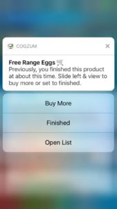 New automatic checks on “At Home”. On top of existing inventory update helpers we added ‘Buy Again’ and ‘Unused products’ smart reminders. The first one checks for important products that are likely to be over, based on their previous buy-to-finish time. The second warns about food which is likely to have been left untouched. They are also accompanied with action buttons that, for example, lead directly into “Buy more” screen or make the change at once.
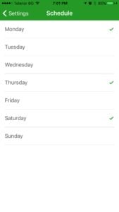 Customization for “Products to Buy”. A lot of people have specific days in the week on which they do their grocery shopping. Now they can set them in CozZo settings and only on those days they will receive the reminder about items, placed on their “To Buy” list. On workdays, this reminder pops at the end of work time and for weekends – at a more appropriate morning time.
A true multi-language support. We created the foundation for CozZo to be used in any language and country by adding an industry-leading framework. The first language that we added to the original one (English) is Bulgarian – this is the country where the project started. Having this framework allowed us to polish some texts and even do an in-app language switch in Settings. You will also notice that each language comes with its own dictionary of product names and a list of “Store aisle” selections.
Finally, some design touches have been done here and there for more pleasant user experience. All those improvements were driven by user’s requests and feedback collected in past 2 months. We hope you’ll enjoy the new release.


Comments are closed, but trackbacks and pingbacks are open.